Admin
User
Client
Aphusys
Category
Human Resource
An HR company in India, which aims to simplify the HR Management process drastically.
Their vision is to simplify the whole HR Management function by making it highly usable by everyone not just by the HR.
Target Users: CEO, Manager, Employee
The present system which is being used by different stakeholders has got numerous features and unfriendly layout, we can say the data is not presented in the right way. We did intensive research on the present design by talking to all categories of stakeholders and present users.
“There’s an extensive and unstructured data which user is unable to use it at any point of time and some of the key features are existing but due to the poorly designed information architecture, the user is not aware of the information that’s present in the system.”
So the information design of the present system has to be enhanced and we have thought of putting the right information at the right place and the user should be able to reach the desired screen in not more than two clicks.
The challenge is about taking things that are infinitely complex and making them simpler and more understandable.
As the existing product is used across different locations by different SME’s, we collected the feedback through telephonic conversations, Stakeholder’s interviews and considered common patterns from the research. Working with already existing data helped us to avoid any guesswork. Using the information provided by the user had a better chance to keep things simple and effective.
First Step is to identify the features that are redundant which we could remove and/or make it as minimal as possible.
Admin
User
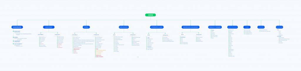
Initial Information architecture is made from the data that’s available on the present system. Then we drilled down to the information that is redundant and not used by any of the users.
The system has everything at every place so we segregated the data in 3 sections to reach to the right place without confusion.
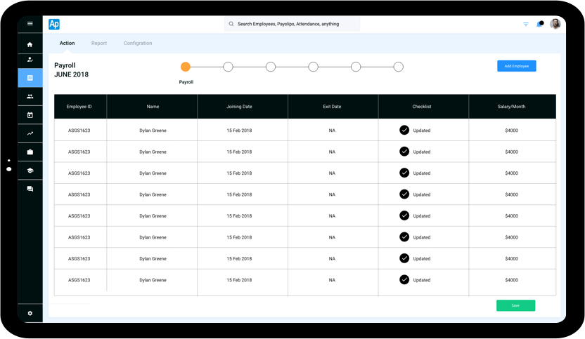
1. Action
2. Report
3. Configuration
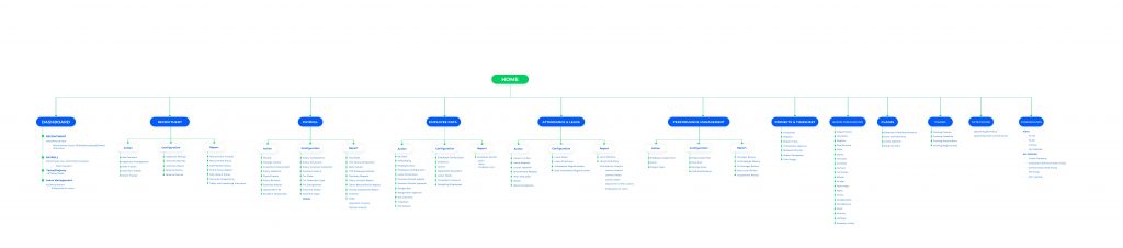
After the initial review of the IA with the stockholders, we understood that the information available is huge and not of much use in the respective context. We redesigned the IA from the inputs received and made it structured.
There’s so much of data available in the system but unable to make use of it as the users are unable to find the information and even the search is not clear for them to use it and to find the relevant information.
Based on the enhanced IA we started sketching out the low-Fi’s
We used paper and pencil to draw different ideas and iterate as and when we felt the ideas are not working out or the user experience is not exceptional.
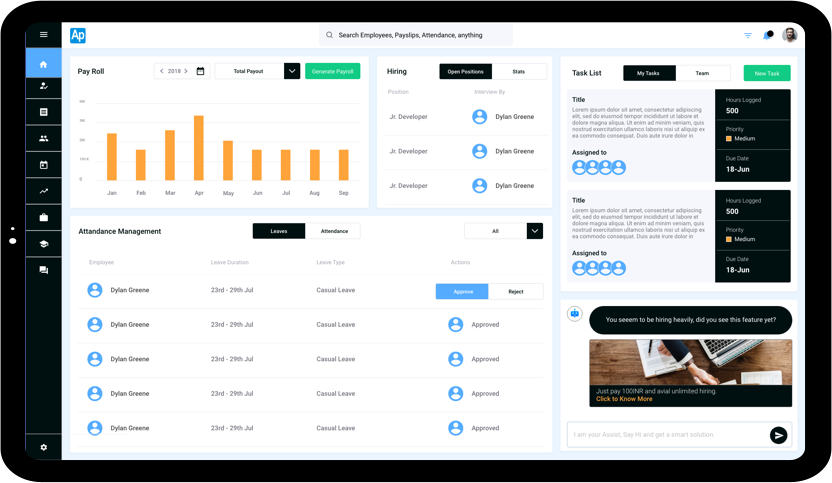
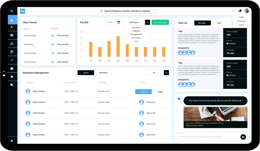
The admin has the control to see the data that’s necessary but the widgets that he wishes to see is also required, we need to have the information that has got some action to perform that had just view only information, which is equally important like the Financial information.
So we rearranged the data for the respective user.
And in the discussion, we understood that there is already so much of user stories available.
Usually, we choose the fields and data and the information is reflected accordingly but in this scenario, we thought the amount of data that has to be enabled is huge so we enabled all the fields and told the users to disable whichever is not necessary which helped the user to click and continue with speed and not to overthink, just uncheck the fields which are not needed rather checking all the 20–30 fields needed.
In the user test process, we discovered the communication in the system is not being used by anyone of the existing customers, so that helped us to keep it at the last and not to push that feature while selling the product to the customers.
Users are reluctant to adapt to the new system for communication with the ones they are already using like Slack, hangouts and mail communication.There’s such a huge data that we chucked down into pieces consolidated and then drilled to three main categories.
1. Action
2. Report
3. Configuration
Under each section, we have bundled the just required ones at the right place and mainly we made the
information easy to consume by segregation and hierarchy of information.
The biggest challenge for the users is to find the information and reach to that information quickly and easily without much effort which we solved and made sure that is done in the right way. There are different ways to reach the information like search has functionality with universal search feature and Navigation and also as an admin, I could rearrange and see the information that’s much needed on the dashboard from where a user can reach to the respective section.
As we are integrating Machine Learning to understand the behavior patterns of the user to suggest him the right product that helps him at the need of the hour, we have put a chat section right on the dashboard to help the user to search through and get there without pain. The chat will also push intelligent ads that can help the user and the product at the same time.
Once the user testing is done, we realized there could be some minor tweaks in the dashboard and enhanced the interaction accordingly so that can help the user to reach the right place in less possible clicks.
At the end of the project, the final design has been showcased to the actual users to analyze the reaction and the overall user experience from the previous design. To our expectation, the users were very happy that they can perform the desired action in lesser interactions and also they like the way where only the valuable information was presented on the platform.
The new users also got hands-on both the designs to check which is the best feasible solution and as expected the new design’s minimal interaction saved over 40% of the time to do the same task than in the old design.